Smarter government UX: New help desk achieved 90% satisfaction
Client context
The Federal Audit Clearinghouse (FAC) is a U.S. government entity that provides access to single audit reports for federally funded organizations. The primary audience includes auditors, government officials, and grant recipients who rely on the FAC database to efficiently access, navigate, and submit audit reports.
Project description
Problem
Users frequently encountered difficulty navigating FAC’s complex audit database and had limited access to clear, contextual help — resulting in high volumes of support inquiries and user frustration.
Goal
Create an intuitive, accessible Help Desk experience that reduces support tickets, improves user satisfaction, and helps users complete tasks efficiently.
Role: Lead Content Designer, CX analytics
Platform: Web (fac.gov) and FAC app
Tools: Figma, Mural, GitHub, Qualtrics
Year: 2024-2025
My Process
I guide each project through six steps: Research, Annotate, Collaborate, Draft, Design, Iterate. It’s part structure, part conversation, and a lot of listening — all to create something that works in the real world.
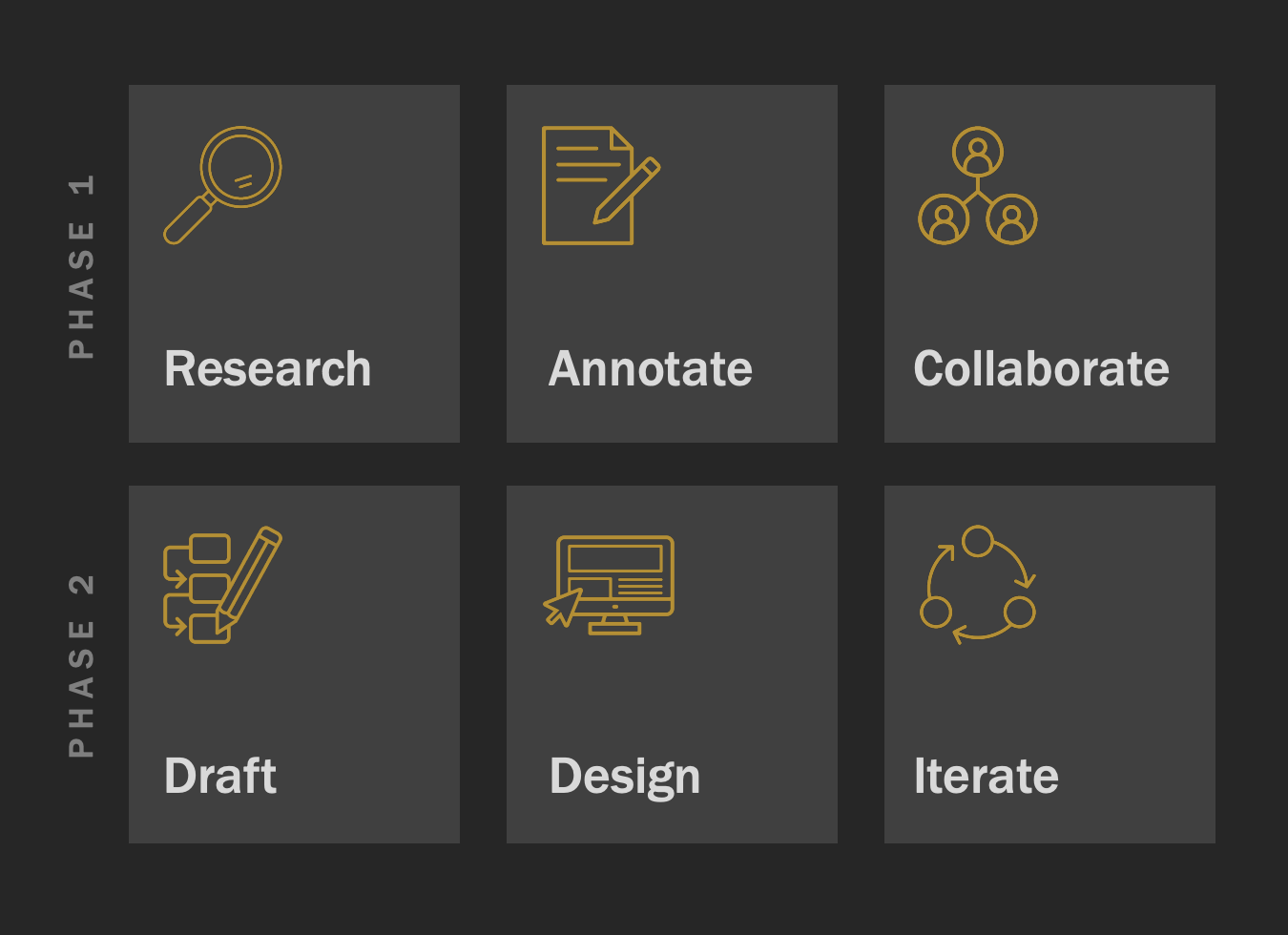
Phase 1: Research, Annotate, Collaborate
Researched user pain points and navigation challenges by conducting stakeholder interviews and analyzing support ticket data.
Annotated existing support content to identify gaps in help resources and inconsistencies in user guidance.
Collaborated with stakeholders and support staff to align on content priorities, feedback channels, and Help Desk goals.
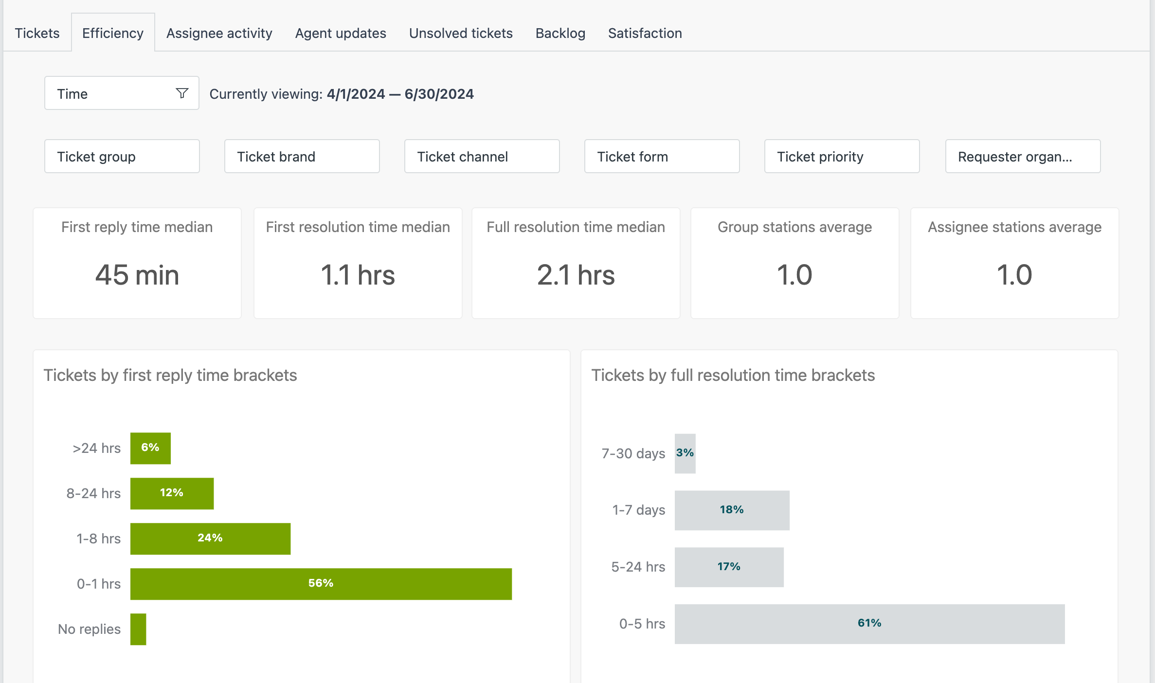
After launching the help desk, I configured Zendesk to track the most relevant metrics—ensuring our team had reliable data to guide research, collaboration, and decision-making.
Phase 2: Draft, Design, Iterate
Drafted and organized 40+ FAQs and learning articles to address common user issues and support self-service.
Designed and standardized 50+ macro email responses to streamline support communication and reduce resolution time.
Built and iterated Help Desk UI prototypes in Figma, incorporating feedback from users and stakeholders to refine layout, content, and search functionality.
Launched a Qualtrics survey on fac.gov to collect user feedback, overcoming regulatory compliance challenges.
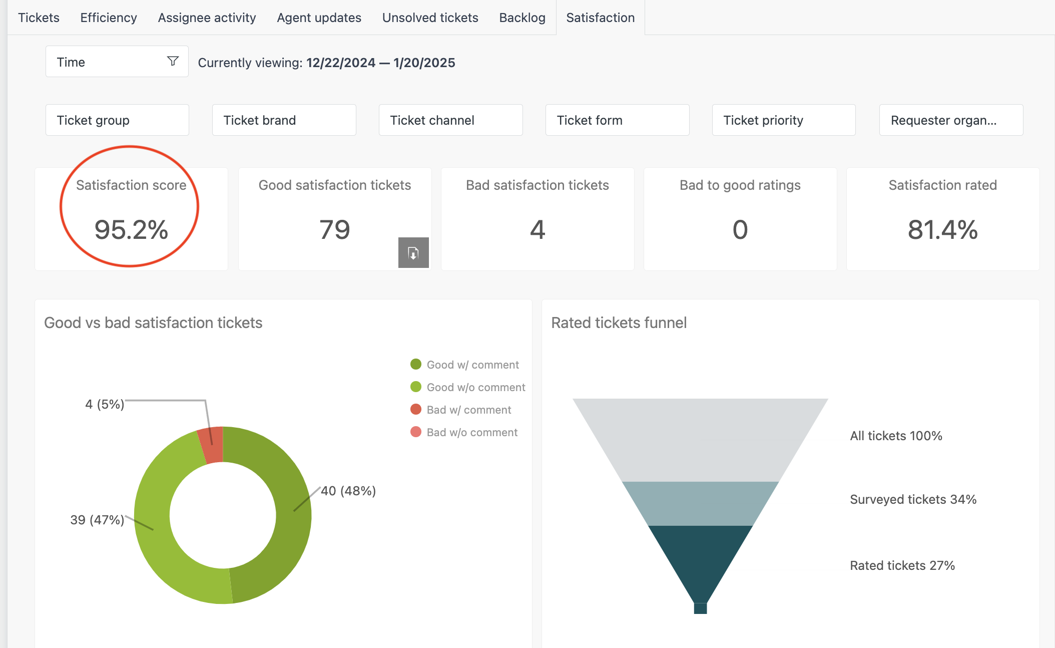
Thoughtful design and a solid support framework paid off—earning a 95% CSAT and high marks across all tracked metrics.

I also secured a spot for our team in a pilot program that let us hear directly from users. Their feedback—full of real stories and context—was a goldmine for guiding design decisions and improving the product from top to bottom.
Output, Outcome & Impact
Output
Delivered a fully integrated Help Desk system featuring searchable support content, consistent communications, and user feedback tools.
Outcome
Achieved and maintained a customer satisfaction rating above 90%, surpassing the client’s initial 70% target.
Reduced support inquiries significantly through improved self-service capabilities.
Help Desk SOPs and analytic tools gained recognition and were adopted by other government agencies, including regulations.gov and search.gov.
Launched scalable solutions that standardized CX processes and improved operational efficiency.
Impact
Enhanced user experience and efficiency on fac.gov and the FAC app.
Established a leadership role in CX analytics and content strategy that contributed to the client’s long-term strategic goals.
Presented innovations and findings to key GSA partners, influencing broader government CX initiatives.
Reflection
Demonstrated the value of combining content design, data analytics, and technical skills to solve complex CX problems.
Recognized the importance of cross-functional collaboration and regulatory navigation in government projects.
Learned the significance of scalable, standardized processes and tools in driving organizational improvement.
Embraced continuous learning and leadership to exceed goals and broaden impact beyond the immediate project.
Final Note
Thanks for reviewing this work. I enjoy showing how content strategy and design can work together to make support experiences clearer, faster, and more human — and I’d be glad to share the details of how this came together.