Designing for fans: UX copy redesign boosts conversions by 22%
Client context
The Broadberry Entertainment Group is an independent promoter, talent buyer, and event producer based in Richmond, VA. The primary audience is concert-goers seeking information about upcoming shows, with events promoted primarily through the website, social media, and email.
Project description
Problem
The existing mailing list widget lacked clear user value and brand voice, which hurt subscription rates.
Goal
Create a mailing list widget that clearly communicates benefits and brand voice, resulting in increased mailing list sign-ups.
Role: Content Designer
Platform: Web, Mobile
Tools: Figma, Miro
Year: 2021
My Process
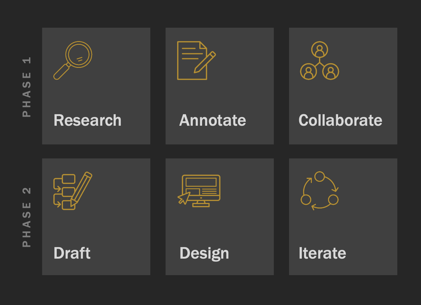
Every project starts with understanding the people who will actually use it. My six-step process — Research, Annotate, Collaborate, Draft, Design, Iterate — keeps me focused on user needs while making space to explore, test, and refine.

Phase 1: Research, Annotate, Collaborate
Researched user needs and business goals through interviews with the company owner, conversation mining, and evaluation of the existing website and mailing list experience.
Annotated the existing widget and related site content, mapping tone, clarity, and value messaging against user expectations and best practices.
Collaborated with the client to align on messaging priorities, tone of voice, and functionality before moving into design.

The original widget relied on bland, generic text with no clear benefit or personality—missing the chance to connect with music fans or give them a reason to sign up.
Key insights from Phase 1: Users want alerts for show announcements and ticket sale notifications. It was essential to balance user empathy, privacy concerns, and business goals by offering clear value rather than just requesting emails. Maintaining consistent branding with playful language was critical.
Phase 2: Draft, Design, Iterate
Iteration 1
Designed the first iteration with a clear invitation, human-centered sub-header emphasizing show alerts, benefit-focused body copy, a prominent CTA, and a privacy footer for reassurance.
Added post-signup confirmation messaging to enhance user reassurance.

Iteration 2
Tested a more concise version with fewer details to evaluate if simplified messaging improved performance.
Iterated based on client feedback, ultimately favoring the simplified version; limited user research constrained further validation.

Before
The mailing list sign-up used flat, generic copy that didn’t communicate why joining was worthwhile. Many visitors skipped it because the value wasn’t clear.

After
I rewrote the sign-up with clear, benefit-driven messaging and added playful, brand-relevant language tied to the concert experience. The refresh boosted sign-ups and made the experience more memorable.

Output, Outcome & Impact
Output
Delivered a fresh, user-friendly mailing list sign-up widget that was built and shipped.
Outcome
Solved a significant user problem while providing value aligned with the client’s goals.
Impact
Brought about a 22% increase in mailing list subscriptions, exceeding project goals.
Reflection
Reinforced the power of user-centric, on-brand microcopy and continuous learning by seeking peer feedback and studying similar companies.
Learned the value of broader stakeholder engagement and user research to improve design outcomes.
Recognized the need to prioritize user testing and deeper research early in the project for stronger validation and collaboration.
Final Note
I appreciate you taking the time to read through this piece. It’s a great example of how small changes in language and structure can boost engagement — and I’d be glad to walk you through the thinking behind each choice.