
404 redesign cut client complaints and reduced bounce rate 42%
Client context
Overcoast is international, award-winning music and sound house with studios in Richmond, VA, and London, UK. In 2021, launched a searchable music library.
The primary users of the online music library are filmmakers, production companies, and advertising agencies searching for songs and sound pieces.
Project description
Problem
The 404 page had a high bounce rate and generated frequent client inquiries about how to navigate from the error state.
Goal
Design a user-centered 404 page to lower bounce rates and reduce navigation-related client complaints.
Role: Content Designer
Platform: Web, Mobile
Tools: Figma, Miro
Year: 2021
My Process
My six-step process — Research, Annotate, Collaborate, Draft, Design, Iterate — isn’t just a checklist. It’s how I get to know users, make smart decisions, and keep shaping the work until it’s something we’re proud of.
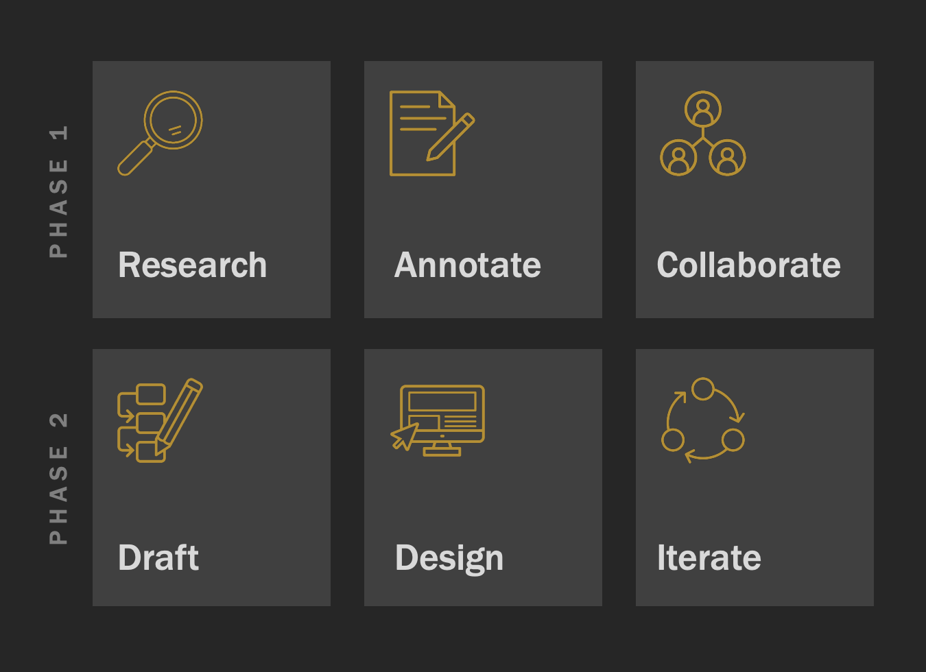
Phase 1: Research, Annotate, Collaborate
Researched user and business needs through client and stakeholder interviews.
Annotated key pages while exploring the site to map pain points and navigation flow with a user-first lens.
Collaborated with the team to flag major usability issues, including a 404 page that disrupted user flow and created frustration.
Key insights from Phase 1: The 404 page must be more useful and empathetic, explain possible errors, provide a clear next step back to the homepage, and maintain consistent branding.
Phase 2: Draft, Design, Iterate

Iteration 1
Added brand logo for reassurance, empathetic messaging, clear home page link, and contact info for further help.
Iteration 2
Created a more concise message with a music-themed play on words (“tracks”).

Iteration 3
Developed a simple, clear, and concise version aimed at users in a hurry or non-native English speakers, while retaining essential elements.
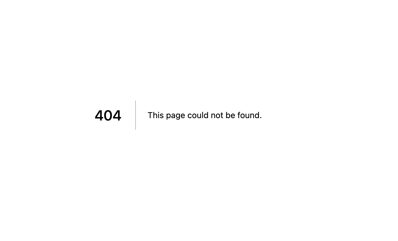
Before
The original 404 page was a dead end — plain error text, no guidance, and no links back into the site. Users either abandoned the site or submitted complaints through customer support.
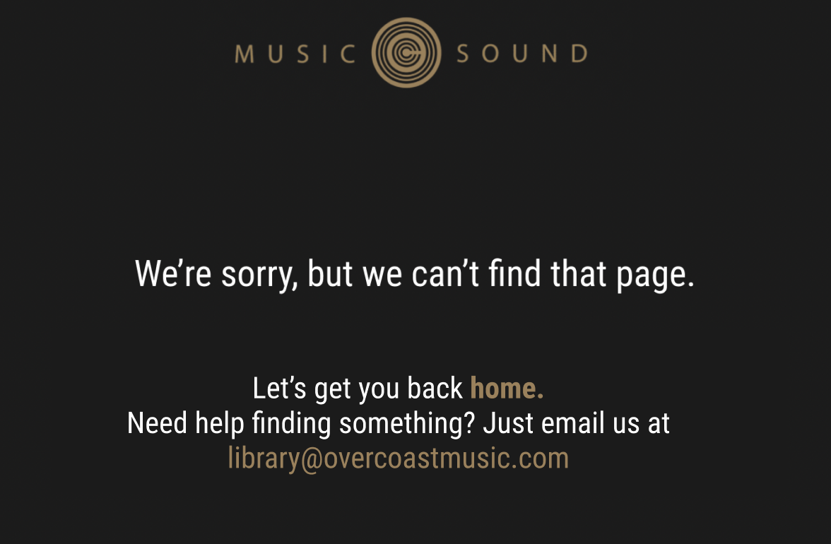
After
I designed a 404 page that turned a frustrating moment into a helpful one. Clear, human copy explains what happened, while navigation links and a search bar help users find what they need quickly. The result: fewer support complaints and a measurable drop in bounce rate.
Output, Outcome & Impact
Output
Delivered a fresh, user-friendly 404 error page (iteration #2) that was built and shipped.
Outcome
Resolved a significant user experience problem for Overcoast and delivered client value.
Impact
Lowered bounce rates by 42% and significantly reduced client emails related to navigation issues, meeting project success criteria. These results confirmed that I achieved the goals that I set in my problem/goal statements.
Reflection
Reinforced the value of continuous learning, seeking peer feedback, and reviewing industry examples to inspire better solutions.
Recognized the importance of gathering feedback from more stakeholders and key clients for further refinement.
Realized the critical need for early user testing and deeper research, as project constraints limited full UX validation; highlighted the importance of a dedicated UX team.
Final Note
Thanks for exploring this project. I’m always happy to share my process and show how even something as small as a 404 page can be an opportunity to help users, reduce frustration, and even add a bit of personality.