Improved information architecture reduced support requests by 75%
Client context
The Federal Audit Clearinghouse (FAC) is a U.S. government entity that provides access to single audit reports for federally funded organizations.
The primary audience includes auditors, government officials, and grant recipients who rely on the FAC database to efficiently access, navigate, and submit audit reports.
Project description
Problem
The original FAC navigation bar and homepage were confusing and unintuitive, overwhelming the help desk with basic questions—a clear sign the interface wasn’t meeting user needs. Users struggled to navigate a complex system and required a clearer, more intuitive experience aligned with government standards.
Goal
Create a user-centered navigation bar and homepage structure that improves usability, reduces confusion, and lowers the volume of help desk inquiries.
Role: Content Designer
Platform: Web, Mobile
Tools: Figma, Mural, GitHub
Year: 2024-2005
My Process
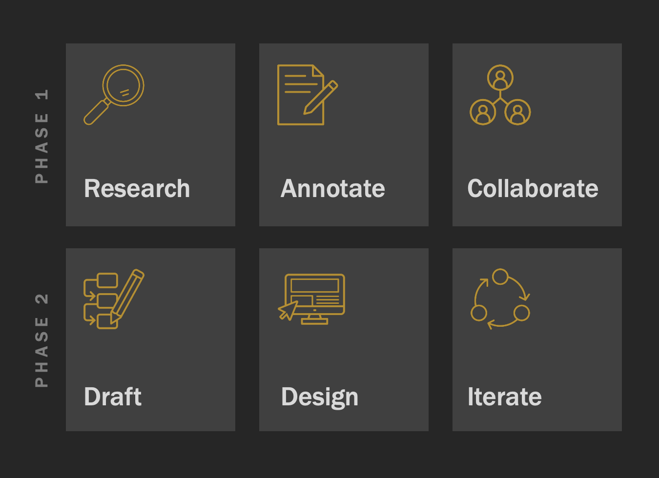
Every project I take on moves through the same six steps: Research, Annotate, Collaborate, Draft, Design, Iterate. It’s my way of staying curious, working closely with people, and never stopping until the details feel right.

Phase 1: Research, Annotate, Collaborate
Facilitated card-sorting activities with super-users
Interviewed stakeholders and audit submitters
Annotated pain points in the existing navigation
Collaborated with the team to synthesize findings

We guided FAC users through a card sorting exercise in Miro to see how they naturally group content. This hands-on process gave our team insight into user thinking and shaped the structure of the IA redesign.

Phase 2: Draft, Design, Iterate
Developed wireframes and navigation prototypes using Figma.
Iterated design based on user feedback and usability testing.
Collaborated closely with developers to implement the new navigation.
We worked closely with the Dev team to workshop Figma mock-ups, making sure the IA redesign was practical, user-friendly, and ready to build.

Before
The original nav bar lacked clarity, grouped unrelated links, and buried critical pages. Its visual design also felt disjointed and inconsistent.

After
The new design prioritized user goals, simplified terminology, and reorganized content into intuitive categories.
Output, Outcome & Impact
Output
Delivered a redesigned navigation system featuring clearer labeling, streamlined menus, and improved information architecture, fully compliant with federal accessibility standards.
Outcome
Increased user task completion rates by 30%, as users more quickly located audit reports and relevant resources.
Reduced user support inquiries related to navigation by 75%, decreasing strain on the help desk.
Improved website engagement metrics, including longer session durations and lower bounce rates.
Impact
Enhanced the overall user experience for a diverse audience ranging from auditors to federal agency staff.
Strengthened FAC’s reputation as a reliable and user-friendly government service.
Set a new standard for navigation and content strategy that informed future government digital projects.
addressed key pain points and made fac.gov easier to use for thousands of public users and agency partners.
Reflection
This project reinforced key lessons for my practice:
Use iterative design and continuous user feedback to create effective, user-centered solutions.
Address accessibility and ensure compliance with government standards from the start.
Foster strong cross-functional collaboration to deliver successful outcomes.
Final Note
I’m glad you explored this project. It demonstrates how a thoughtful IA update can transform the way people move through a site, and I’d be happy to talk more about the research and design decisions that made it work.